


Sector 7 Theme Park POV Design and Illustration
Chris Chien takes us through his process for creating a Final Fantasy inspired theme park space and some tips he learned from Luc Steadman in Themed Environment Design.
Introduction
My name is Chris Chien. I’m a concept artist specializing in themed entertainment. I’ve been working in the industry for 10 years. I graduated from Carnegie Mellon University with a degree in Industrial Design back in 2010. I’ve worked on projects such as Universal Studios, SeaWorld Sesame Street land, Ferrari World and Kennedy Space Center.
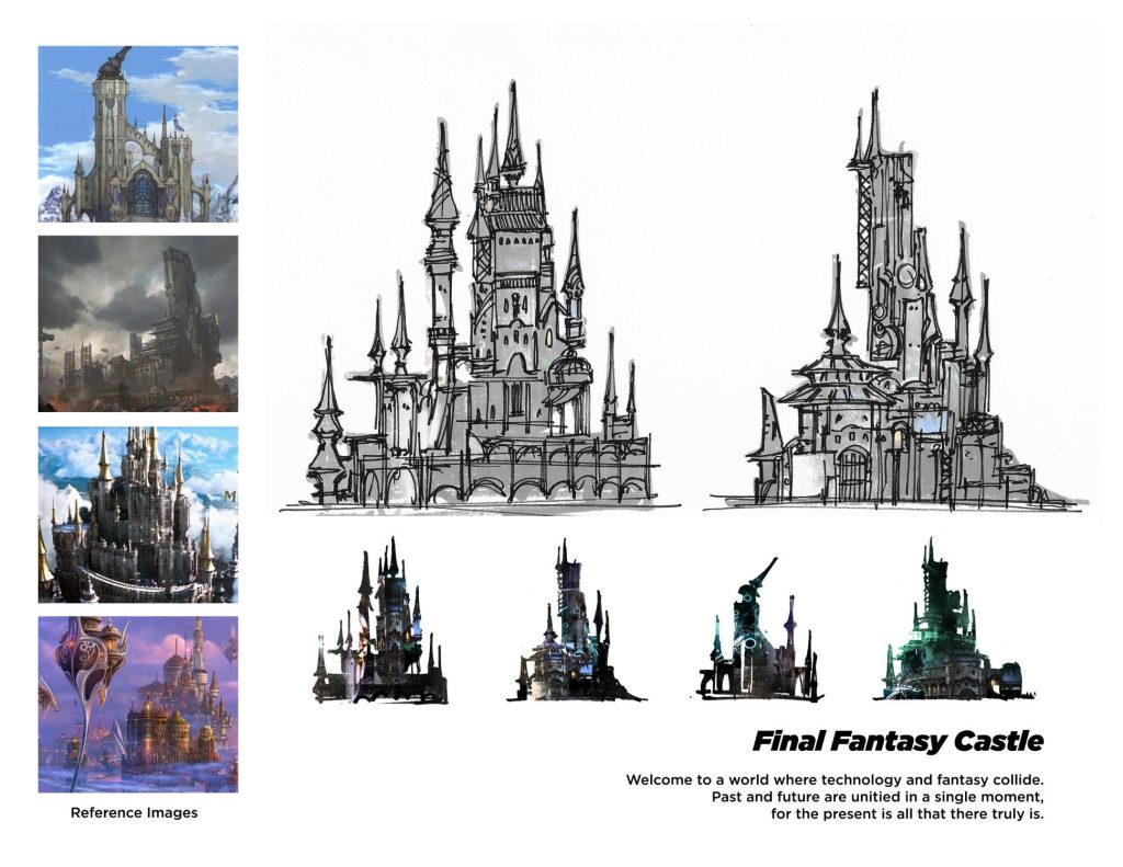
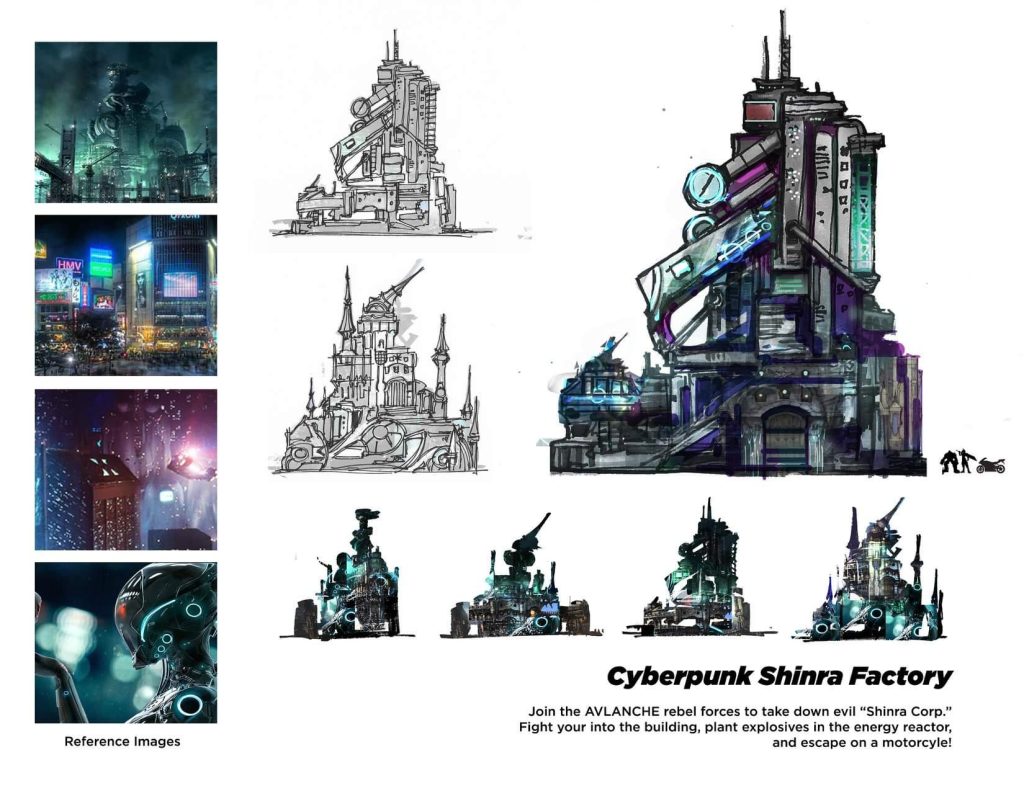
Design_01 // Story, Research and Conceptual Sketching
Story is the fundamental building block of any good design. I created a little description, gathered some reference images, and proceeded to create thumbnail sketches of the main building of the theme park land. I explored two different directions – a Medieval Fantasy version and a Futuristic Cyberpunk version. I created many silhouettes and variations of each building, and decided to go with a Sci-Fi direction.
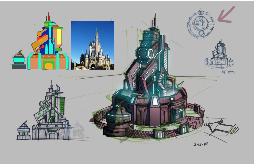
Design_02 // 3D Modeling
Here I created tighter line drawings, a plan view, and a perspective sketch to figure out the 3D dimensional forms. Sure it looked cool in the silhouette form, but translating it into 3D is another story. Next, I modeled it using SketchUp as my modeling software, and Enscape as my rendering platform. This step is crucial to understanding what the building looks like at all angles.

Design_03 // Elevation Drawings
This next part was super interesting. How do you know how big to make the retail shops so that it looks believable for a theme park? This is a trick I learned from my instructor Luc Steadman, while I was taking his class at CGMA. While we cannot access blueprints to existing architecture from Universal or Disney, we can look on Google maps, get an estimate of our big the buildings are in relation to each other, and use that scale to make approximate concept drawings! Using this technique, I’m able to create immersive architecture at a believable scale.

Design_04 // Masterplanning Drawings & 3D modeling
Here I created a top down view of the theme park called a “masterplan.” While it looks simple, this is often the most difficult and time consuming part of the process. In a professional project, the “masterplanning” phase would take months to create! Teams of people would be in meetings for hours on end, with probably hundreds of different iterations until they create one that satisfies many engineering, safety, theming and design requirements!


Design_05 // Exporting a POV from the 3D Model
Using the 3D model I created from the previous step, I zoomed into the eye level of the guest and export a view that I think looks says “wow” – and would sell this space. Finally, we can start the illustration process.

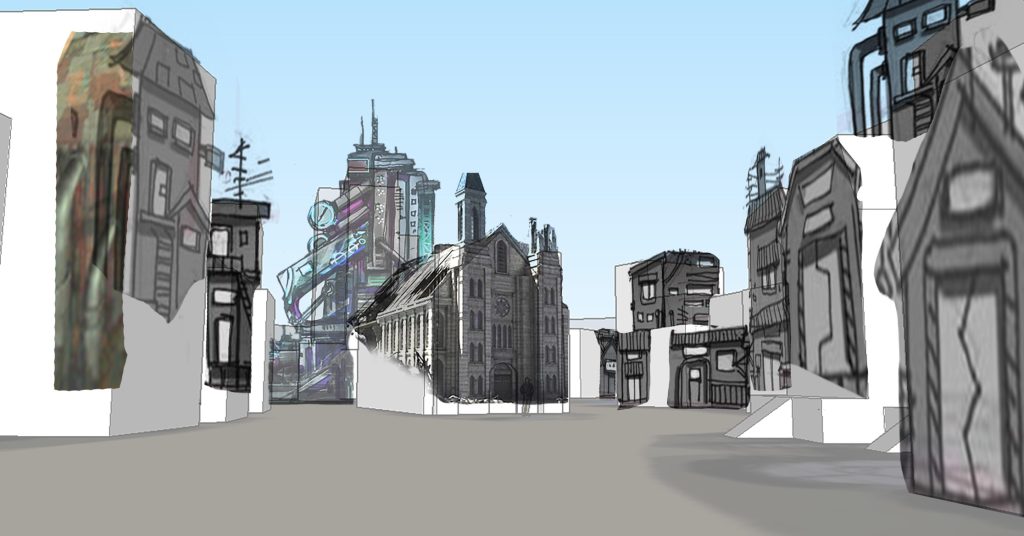

Illustration_01 // Value and Color Studies
Just like how story is fundamental to a great theme park experience, color and value is fundamental to a great illustration. Before going into any of the details, I created value and color studies to explore the different lighting and color scenarios, while thinking about how I want this piece to feel.


Illustration_02 \\ Photobashing
This is a rough color pass. I have used many photo elements to quickly establish lighting and texture of many of the scenic elements. Adding in photos of people really helped give the place a sense of life as well. An illustration at this level is useful for having a conservation with the design team and evaluate how it is looking, but this is clearly not the finished product.
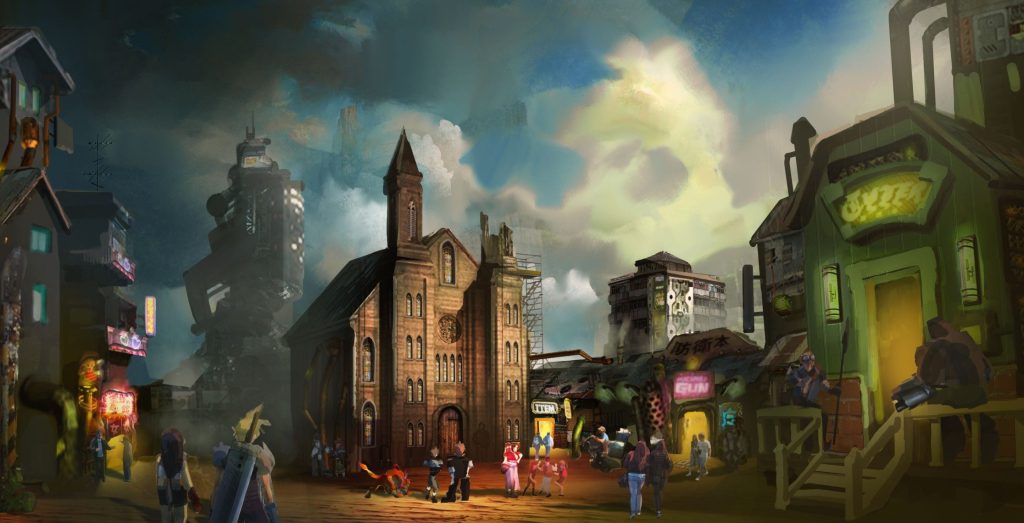
Illustration_03 // Lineart
I liked what I did with the photobashing phase, but it just seemed really soft and I decided I needed to go in and precisely establish what the designs of the buildings really were. To go forward, sometimes you gotta take a couple of steps backwards. For the linework, I started with very primitive and geometric shapes. Only after the big shapes felt good did I start adding in secondary shapes. At the very end, I added in a lot of small details, window, pipes, weathering etc… It’s important to not jump into the details right away. You need to establish the bigger picture first!
Although doing lineart is laborious, I enjoyed this process because I think doing lineart is where a lot of artists start their journey – with a simple pencil. This phase entailed looking at photo references, and even going outside to look at a lot of weathered Florida apartment buildings. I even got a lot of inspiration from going to Star War’s Galaxy’s Edge!
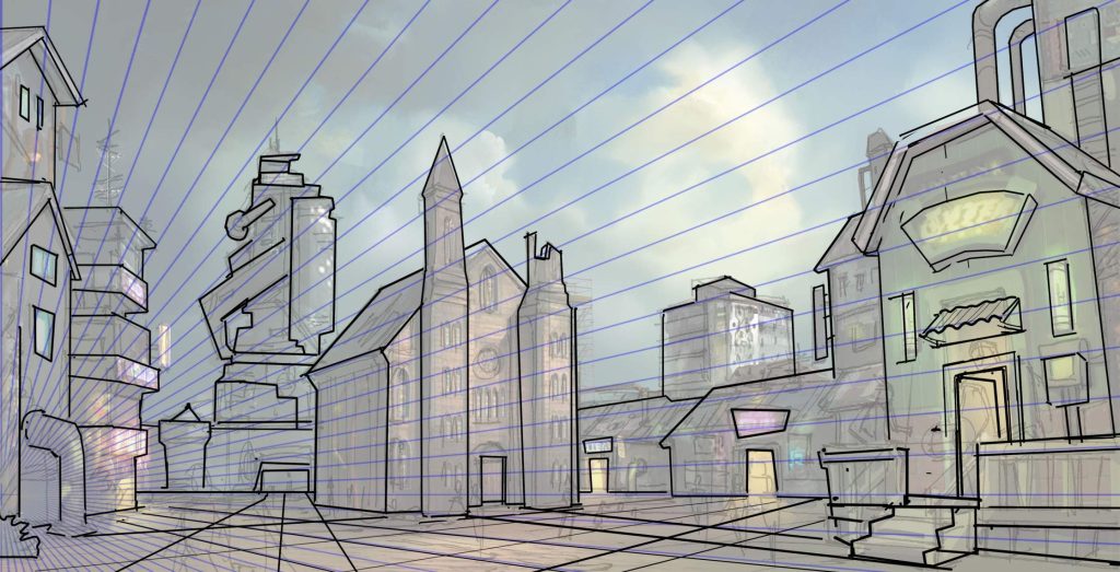
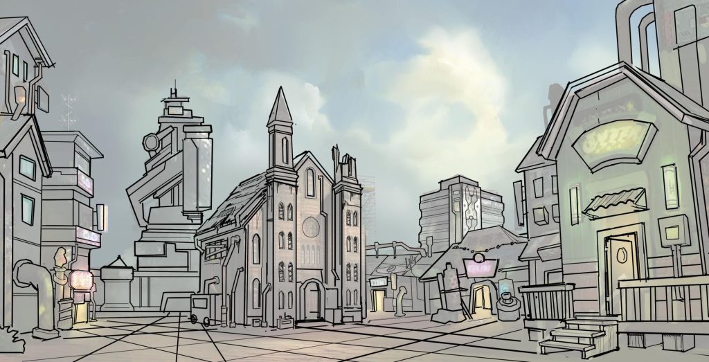
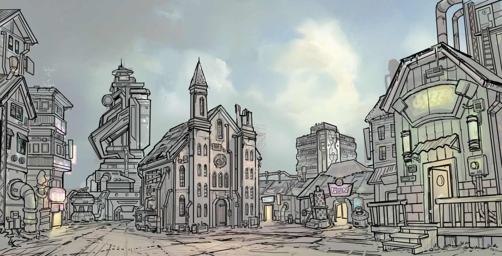
Illustration_04 // Greyscale
Before you start going into color, it’s important to first have a greyscale image of the illustration. The greyscale image conveys the mood and story of the piece. And if I could sum up the mood in one word, it would be “hope.” I wanted to convey the story that in this desolate and dark city – with stormy clouds overhead – there is a ray of light and a possibility of a better future. I painted this all on 1-2 layers, relying on mainly my gut and painting in a very intuitive fashion.
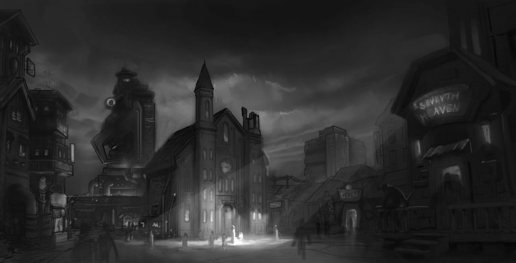
Illustration_05 // People
After the greyscale image, I needed to put in the people. I did not want to completely use stock images for everything. So I drew some of the main characters who had interesting outfits, and filled in the rest of the people from my collection of stock images to lessen the amount of work.
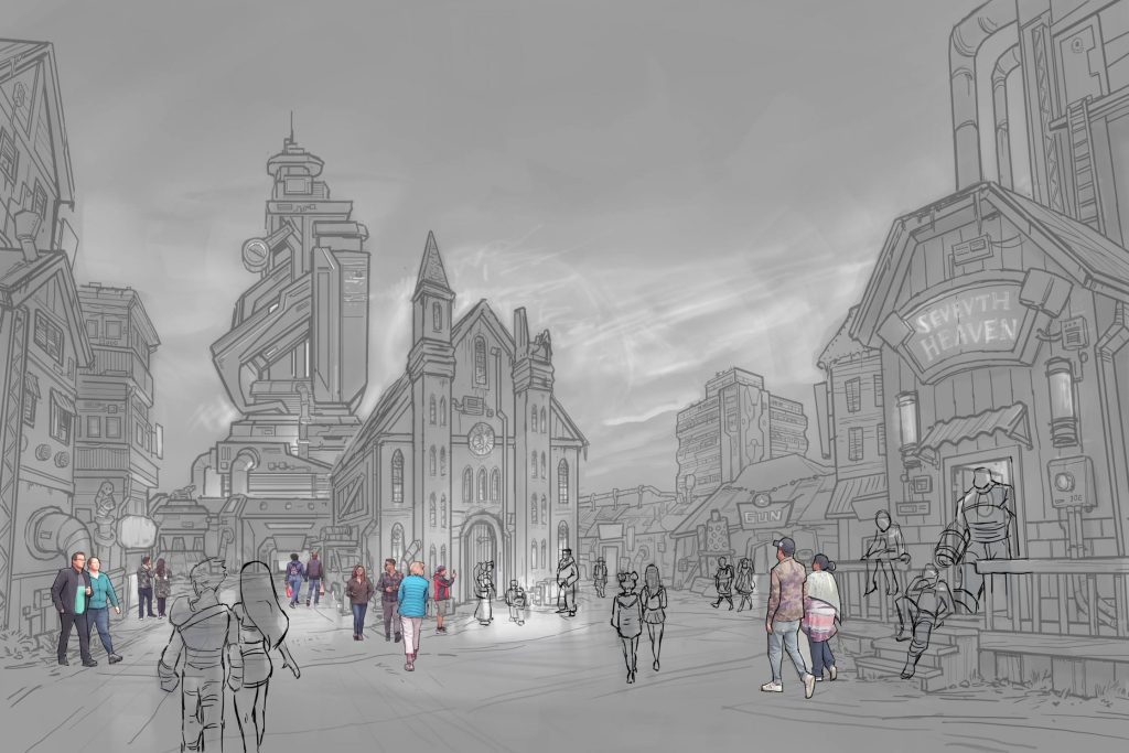
Illustration_06 // Base Colors
Having done all the people on separate layers, I hid the people and just focused on the buildings. I used a regular round brush with some color jitter so I was able to get lots of color variation and a very impressionistic and gritty look.
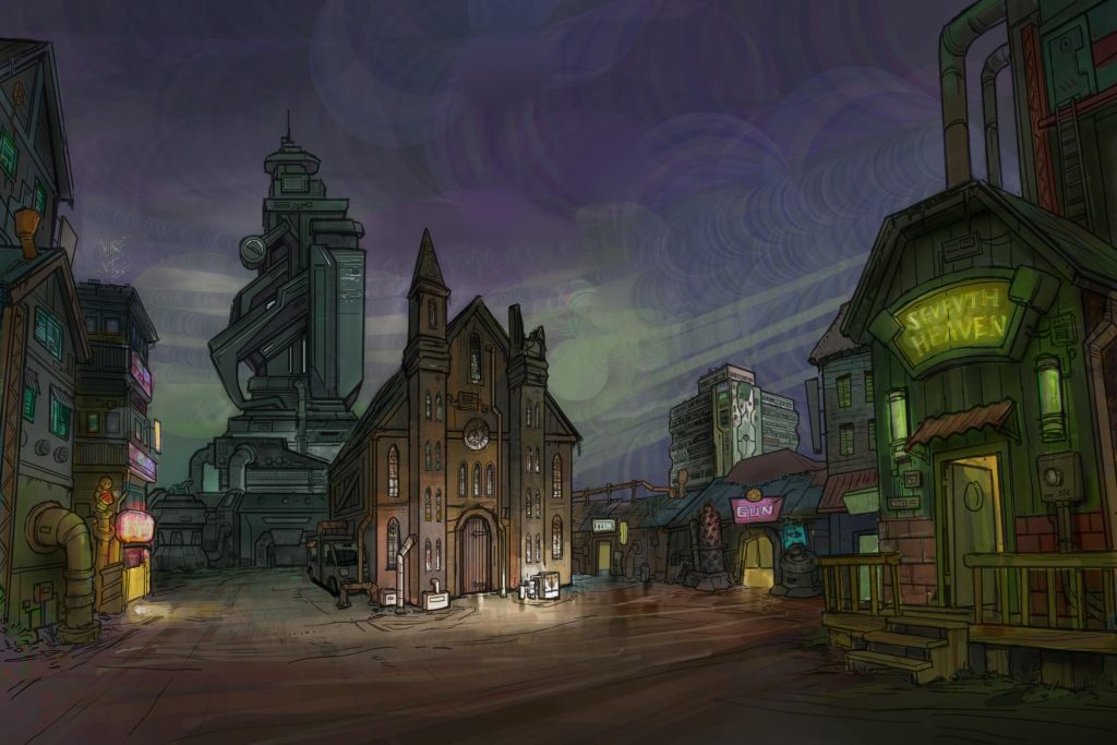
Illustration_07 // Signage and Lights
Now we are having some fun! Here you can see that I added some text and signage to give it some life. I’ve also re-introduced the people to see how everything fits together.

Illustration_08 // Details, Highlights, and Atmosphere
This stage took a LONG time. I am finally starting to add detail. I zoomed into to every corner of the piece to render out forms, adding textures and highlights. At this stage, I was constantly referring and flipping back to the greyscale image I did in Step 4. It is a common mistake to add TOO MUCH detail and make the illustration look too busy. Your brushstrokes might be doing more harm than good. At this stage, I was trying to exercise restraint so it conveys my original design intent in a simple and clear way.

Illustration_09 \\ Adjustment layers, Color Dodge and Effects
Here in the last step, I applied adjustment layers such as Color Balance, Brightness/ Contrast and Unsharpen Mask. While this step seems really important and does a lot to make the colors “pop” – this step would be be ineffective if it were not have a solid foundation of design and illustration that was built underneath.
Often in a production pipeline, concept artists are not afforded this much time to plan out and polish a piece. We must paint fast and iterate quickly to meet the demands of project deadlines! In contrast, it was really nice to do personal painting where I could really take the time to treat a painting as a “work of art.” This is a useful practice because many of things that I practiced in my personal pieces can be applied to my professional work.

Afterword
Thank you so much for checking out my concept art tutorial. I hope you were able to learn something from this – if not I hope you were just entertained or intrigued by the process. If you would like to stay in touch and learn more about my process, you can follow me on social media at the following links.
Instagram: https://www.instagram.com/themeparkarts/
Facebook: https://www.facebook.com/themeparkarts/
YouTube:
Art Portfolio: www.chris-chien.com
Email: [email protected]
