Starting With a Strong Shape
Seiji Lim talks to us about how he strengthened his skills through shape design in Nate Wragg’s Character Design for Animation.
Introduction
Hi, I’m Seiji from London, UK. I’m currently a freelance artist and my goal is to work in the Animation/Film/Videogame industry. I’ve previously worked as a Character Artist at Disney Consumer Products and have a B.A. in Animation Production.
My primary goal in taking Character Design for Animation was to go beyond ‘same face syndrome’ (all of my characters looked the same). I’d taken other CGMA courses to address my weaknesses and expand my art toolkit and the instructor’s details and pointers had helped me greatly. Being accountable on a weekly basis to an industry pro and classmates was a motivator for me to get a decent piece completed on time, instead of procrastinating over a perfect piece that would never be finished.
Shape Language

The assignment goal was to design around 3 distinct shapes (triangle, circle, square). I wanted to use the shapes as a jumping off point to accentuate each personality and echo it throughout the design. I didn’t want them to come across as too creepy but also not too familiar. I had a hybrid Zelda/ Tim Burton tone in mind. You wouldn’t be sure where their allegiance was if you met them. I wanted a range of potentially dangerous to timid to come across, like an odd bunch. I tried to avoid making them look overtly heroic or villainous. To this end, the designs avoided anything overtly grotesque, and the poses were slightly goofy.

Design Silhouettes

I chose the keywords, ‘determined, aggressive, and disciplined’ and designed everything around that (shape, pose, expression, and props). I thought the arrows already shot into his shield could demonstrate his ability to maneuver under fire. I felt a triangle-based shape theme and a pro-active, determined stance would fit his demeanor and function. Also, I wanted him to look nimble so I stayed away from stiff, clunky-looking armor. It was challenging to balance a dynamic range of small, medium large shapes and curves vs straights. If the design was entirely composed of straight triangles it might appear dull or too flat for the desired style.
Character Line Ups

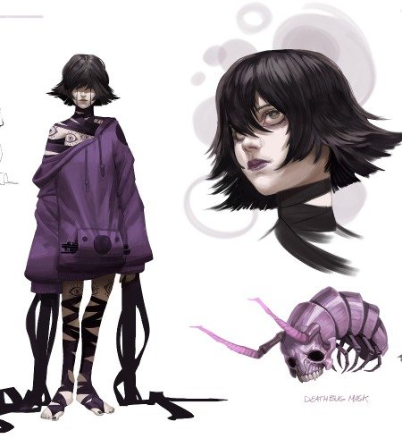
This assignment allowed me to put into practice the main reason why I’d taken the course, which was to learn how to create distinct, diverse characters I chose the personality types of ‘crazy, powerful and cool’, and conveying these as clearly as possible dictated all the design choices. In my process image, I’m exploring details and accessories (eg. weapons and costumes) that could give extra insight into their character. My primary inspiration for these characters were 2D arcade fighting games. I really enjoy the bold designs and poses often seen in those series, so I wanted to do my own take here. I wanted them to contrast and balance in terms of silhouette/shape, personality, and scale.

Character Story Moment

The core idea was to illustrate the frustration that can arise from struggling to do the right thing and seeing others(seemingly) succeed effortlessly. This was one of the cases where I didn’t thumbnail multiple takes. The pace of the weekly assignments incentivized a quick turnaround so I wanted to get on to the execution as soon as possible.
I wanted to have the two characters that contrasted in as many ways as possible, but I didn’t want to portray the difference for difference’s sake. So, the food props are switched from what you might assume to give motivation for the expressions. If it works, hopefully, it’s relatable without having to read a blurb! I wanted to make sure everything read correctly so I kept the background blank and the characters in greyscale, reserving color for the food because I felt that was the key to the story beat.
Final Thoughts
I was familiar with the basics of character design theory but wanted to go beyond ‘shapes for shape’s sake’. Nate showed how basic shape language could be a kicking off point for the process or a troubleshooting method to help clarify design ideas. Ultimately, mixes of shape types and variations could be used, as long as the overall design was strong and clear.
I’d take the assignments as far as I could, and Nate would push the features and shapes further in ways that made sense and directly improved the design. I think this is particularly evident in the ‘before and after feedback’ for the ‘librarian’ assignment because I was experimenting with creating characters outside of my usual range.

If you follow artists online and like their work, see if they have a course online. I followed Brent Noll and Marco Bucci on YouTube and they both have courses on CGMA which I’ve taken. I was already familiar with their delivery style and their content addressed my weaknesses, so it was a great fit.
Also, I’m a big believer in drawing inspiration from whatever you’re passionate about outside of your chosen discipline (my random mix is snowboarding, Bob Dylan, and martial arts). Switching it up helps keep curiosity fresh, recharge my batteries, and add new angles. Otherwise, I waste too much time comparing myself to other people and getting frustrated.
Thank you CGMA for inviting me to contribute. Good luck with your art journeys!
You can follow Seiji on his sites here:
Instagram: @seijiartwork
Portfolio: www.seijilim.com


