


Magical Musing of Agnes Toadfoot
Character Designer Paul Joseph Nicholson tells us how 8 weeks in Character Design For Production helped him transform his witchy idea into a fun-filled final design.
Introduction
My name is Paul Joseph Nicholson. I live in London, England. I work as a freelance character designer, although I’ve done a number of other roles in animation over the past few years, before fixing on character design as my career.
I’ve always drawn since I was a kid, but never pursued it academically. I came to the industry later than many people. Instead, I worked for nearly a decade in finance, before deciding to go back to college to pursue the career I’d always wanted to do.
I studied Character Animation at Central Saint Martin’s in London and from there had a number of varied roles in animation including working as a prop designer, colorist, and layout artist.
I recently finished up working as a designer on the new series of Mr. Bean The Animated Series, which is the biggest gig I’ve had since graduating. It was a pretty varied role – doing animation layout, backgrounds, rigging characters, and props for the show. It also gave me a deeper insight into the TV animation pipeline.
I’ve been pivoting my career over the past couple of years toward being a character designer, specifically for TV. I’d already completed two CGMA courses with Nate Wragg in 2017 and 2018 and was in the process of building up a character design portfolio. I wanted to do this course for some time, as I liked the focus on designing a single character over an eight week period, which would give me an opportunity to explore their personality more and push the design further, along with getting great feedback from Nate.
Designing a Character With Story
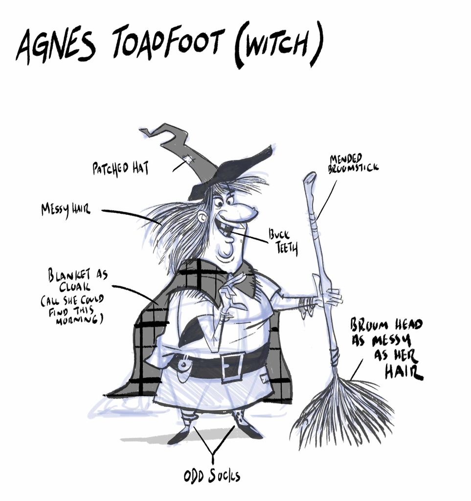
I came up with an elderly witch named Agnes Toadfoot. She’s an absent-minded, eccentric, and inquisitive character who lives alone on the edge of the Ebony Forest. She’s short and stocky, with long hair and a big nose. Other witches see her as a joke, because of her forgetful nature, despite being knowledgeable on witch lore and magic. To prove to her detractors she’s a competent witch, she’s decided to retake her witching exams, which she had failed when she was younger. But a condition of this is that she has to take in a young apprentice to train – something her rivals will hope she will fail at. I wanted to explore a rich, complex character, who could provide a lot of comedy moments but could have the opportunity to emote. Outwardly she seems clumsy and muddled up, but actually, she’s a really knowledgeable witch with a lot of good ideas – it’s just she can’t always remember her spells correctly.

I brainstormed a number of character/occupation combinations, which was the basis of the first assignment. I hit upon the idea of doing a forgetful witch character, which seemed like a fun idea and had a number of opportunities for designing an interesting personality. I started thinking about this character and what sort of person they would be. I avoid drawing too soon, as I like to mull over the character for a while before committing pen to paper.
I have a series of questions written down that allow me to build up an idea of the character’s personality and motivation – such as looking at their strengths and weaknesses and listing their positive and negative personality traits. A lot of this is pretty rough at this stage, but it gives me something to work with as I move into the drawing stage.

Then I gather reference. I looked for old illustrations and photographs of witches and witch costumes. As she had a broomstick as a prop, I also gathered some references on those and assembled them onto a single moodboard to refer from whilst I was developing Agnes. I was inspired by the shape language of character designers such as Steve Lambe and Chris Battle, although my style differs a lot from their work. I also love the rich color choices and proportions of Fabien Mense, which pulled the direction of some of the color choices I made later on. In another course, Art Direction for Character designers, we were taught how to pull different elements from artist’s styles and mix them together to make something unique, which was what I tried to do here on this character.
Character Pose and Expression Sheets

I wanted to choose poses and expressions that summed up her witchy nature, such as performing a spell, riding a broomstick, or making a potion. At the same time, I wanted to show her forgetful nature and her overall clumsiness in performing a spell. Because she’s such an exaggerated, cartoony character I wanted to make these poses a strong as possible, but inject a little humor into them at the same time.


There was a number that didn’t work – especially during the first passes. Early on, you’re generally figuring out what works with the character and what doesn’t work. In a lot of sketches, I did quick silhouette studies, to see if the pose was reading clearly – those that weren’t I’d either tweak or reject. I also chose poses that showcased her personality and what she was thinking. I keep things sketchy and loose at this stage and make a lot of quick gesture thumbnails. I then put the drawings away for a day and came back with fresh eyes and decided which looked fun and interesting and develop those.

I like to explore a large number of poses for any character I design because it’s important for me to understand how they move and where their weight is distributed. I also wanted to see how far I could push certain poses to check that her design worked – in some cases, I had to tweak it a little, such as the length of the arms and legs, to make the poses clearer. I try to push as much as possible, though it’s always challenging for me to break the design. But I enjoy the process, and it’s these moments that the character really comes alive and gives me an opportunity to really showcase her personality.
Model Sheets

The turnaround was probably the hardest part of the course. I’d not done many turnarounds before and I was looking forward to the challenge. I discovered you need to work slowly and carefully during the turnaround stage – it’s important to make sure all features line up on each turn, so this meant a lot of guidelines in Photoshop. As a result, it was very different from the quick studies I had been doing for Agnes’ expressions and poses. The biggest problem was turning the character’s feet. On my original submission, I had the feet and lower body turning more dimensionally in space – however, this tended to change how she looked on each turn. Nate’s feedback showed me how to flatten some elements of the character on each turn, whilst preserving the volume, to give greater accuracy to the character between each pose. This was a big revelation to me, even though in hindsight, it was common sense.

It’s always challenging to move from a three-quarter view to a side view – as I find a lot of changes in terms of proportions when moving from one angle to another. The back views were also difficult, as it meant thinking a lot about how the features translate from back to front. The core skill is making sure there’s consistency between each turn.
The Hero Pose

I’d produced a number of character poses during pose week and had one pose in mind already for the hero pose. I wanted something that had a strong silhouette and summed up her personality and point of view neatly. I had her performing magic, whilst looking at a spellbook, which balanced her magical nature with her forgetfulness. It was then a case of referring back to the character turn and earlier pose sheets to ensure she was on model.
I wanted the pose to show two things – first, that she was magical, and second, she wasn’t entirely competent as a witch, or at least, she was still trying to learn her craft. I went with having her looking at a spellbook, whilst trying to perform a spell. I had the idea of creating a single line of action that ran along her arms, linking the hand performing the spell to the hand holding the book. I chose two props in the end. The first prop I designed was her broom, which is her hero prop. I took a similar approach to design it as I did to designing Agnes; exploring a number of shapes and coming up with a final design that I felt best suited her personality. A broomstick is an important element of what audiences would expect a witch to possess, but at the same time, I wanted to find a design that was unique to her. I also had to bear in mind that this is a prop that she would have to use, such as flying or sweeping up with it, so I needed to design it with her proportions in mind.
The second prop was a small clasp, which she would have affixed around her neck to hold her cape in place. This was a small detail, but I wanted to design it accordingly. Sometimes, it’s the small details on a character that really adds to their personality. I looked at a number of ideas – but settled on a toad design – which reflected in part her name – Toadfoot. As before I came up with a number of iterations before settling on a chosen design.
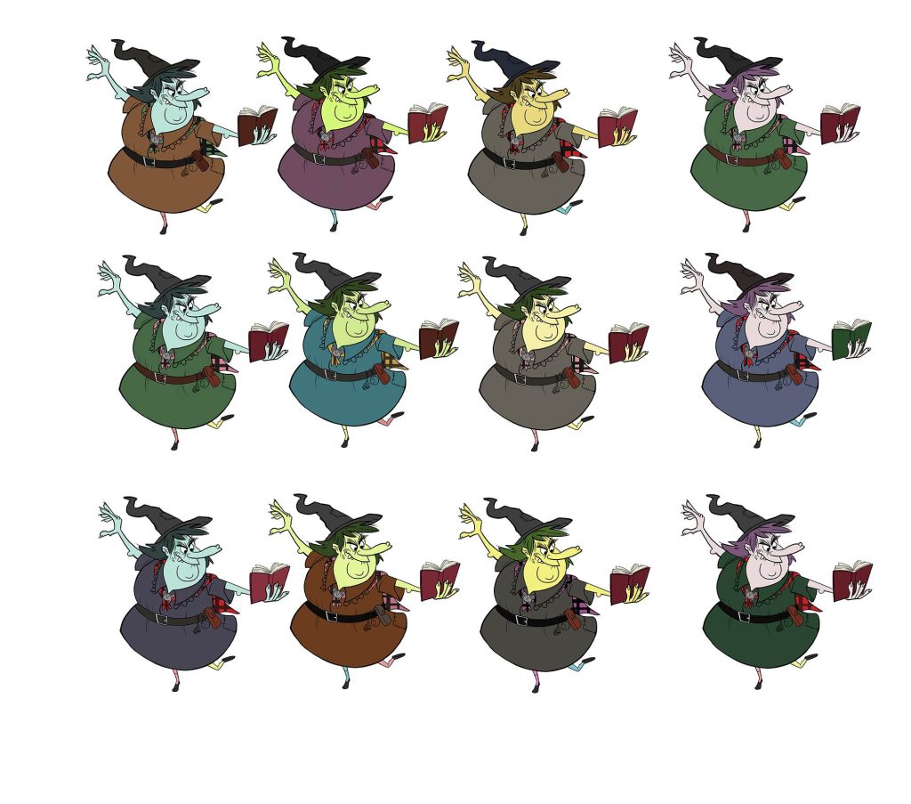
It was quite late in the process before I decided on color, working in values until week 7. The first thing I did when I started exploring color was to make a number of thumbnails with different variations for her skin and clothing. I wanted to create a strong contrast in the design. I decided to go with the green skin and purple dress as this seemed most eye-catching, but at the same time, there was something familiar in that color scheme.
Putting It Together


For the story moment, I wanted Agnes attempting to perform a spell or making a potion and Agatha trying to give her advice or telling her off for her poor spell making. I also wanted to add extra characters (which was part of the assignment) to add to the storytelling element as well as a background to give a sense of place. I played around with composition – sometimes placing Agnes in the foreground, sometimes in the background. I use a thirds guide to help set up the composition, so there is action happening in each third, and characters are placed so they can lead the eye through the image to tell the story.
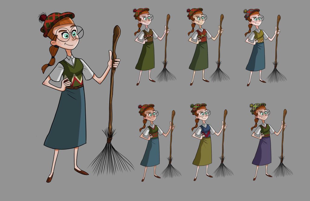
We had to add a second character in the assignment, so I developed the apprentice character, Agatha, who I’d developed in my original story notes. I took her further, repeating what I’d learned with developing Agnes and coming up with a character design I was generally happy with. I like designing opposites in characters and imagined Agatha as being more studious, a little more prim and proper, and physically taller and skinnier than Agnes. That way the two characters are clearly distinctive when paired together. It was important to highlight the differences in their personalities in this moment. The third character was added at the last minute. The initial thumbnail had her levitating an object, but I swapped it out for a little critter, who is Agnes’s familiar. It was nice to develop three characters interacting. It meant there was action in all three-thirds of the design and the eye could be lead from Agatha through Agnes to the critter. I wasn’t entirely sure what to portray so I made a number of thumbnails based on some of the earlier poses I’d done of Agnes.

I wanted to create an untidy cottage for the background since Agnes is quite messy. There are lots of bottles and objects lying around. The difficulty here was that I wanted space for the three characters so I had to leave a lot of room in the center of the image and move a lot of the objects to the sides, so the characters had room to perform.

Final Style and Portfolio Assembly

Agnes changed a lot during the course. My initial sketches had a skinnier, taller character. However, as I refined her and pushed her proportions, she became shorter and stockier. Looking back, the original sketches I did of her didn’t quite convey the personality I had in mind. As I developed her design over the eight weeks, I felt she became a stronger character – this was particularly true during the pose week, where I had to make a lot of refinements so I could get the character to move but still retain the overall design.
The biggest decision was to keep the energy in the character’s poses when cleaning up. This was especially true when inking, where I used long fluid strokes to replicate the energy of the original sketches. It’s easy to tighten up too much in the cleanup stage and lose some of the magic in the original sketches. I also had to think about preserving the characters’ proportions that I’d developed in their earlier sketches and keep an eye on things such as tangents and making sure the pose still reads. It was also an opportunity to check for any defects in the design and to make final tweaks before calling it done.
Final Thoughts
Nate was excellent. His draw-overs were very helpful and gave me new ideas to explore every week as well as helping to push my designs further. I realized early on that he liked the name Agnes Toadfoot and that I was developing an appealing character. He gave me the motivation to create a really interesting personality for Agnes.
It’s always challenging – it’s so easy to skip ahead and produce a ‘final’ design on the first day. The problem with that is that you usually settle on your first idea, which is rarely your best. Instead, it’s better to take things slow, making sure you explore all options, coming up with many different design iterations. It’s also important to refer back to your character personality questions and of course your research. It can be disconcerting, but the process is a means to an end – creating a great character for film or TV that fits the story.
This process gave me an idea of how to develop a full character design pack for a studio or client and the process of making that. I also feel a lot more confident in approaching a professional character design assignment, knowing what I need to produce, how to develop a character with a story in mind, and how to push my designs further to make a truly memorable character. It was very enlightening. Although I was aware of the way characters are designed for TV and film, I’d never actually followed a full production pipeline for character design before. It’s given me a new process to develop characters both for clients and for my own personal projects, which I’m looking forward to implementing from now on.
You can see more of Paul’s work here:
http://www.pauljaynicholson.com/
https://www.instagram.com/pauljaynicholsonart/
