Designing for the Enemy
Martin Hohnel takes us through the design for his post-apocalyptic inspired villans in the 8-week Costume Concept Design course.
Introduction
My name is Martin. I was born and raised in Germany. After I graduated from university with a bachelor of arts in multimedia design I started working as a visual effects artist for feature film and TV. During this time I ended up working in London, Singapore, and Shanghai. While this job served me well for quite some time and I had the chance to work on many interesting projects including Rogue one, Transformers 5, and Game Of Thrones. I was always longing for a position that allowed me to explore more of my creative side.
My passion lies in creating compelling environments and characters. After taking some fundamental classes at CGMA I took the next step and picked a more specific class. I was always inspired by Phil Boutte’s work and having the chance to have him as an instructor seemed like an opportunity I didn’t want to miss.
Ideas, Reference, and Thumbnails
Since I am a big fan of survival games I imagined myself as a costume concept artist working on a survival game that revolves around a post-apocalyptic dystopian future not too far from now. The story of the game would be very much grounded in reality.
My job was to design two costumes for a male and a female enemy character. The main influence I picked was a stereotypical version of a hillbilly character and to spice things up I looked at Celtic history. There is something very fascinating about Celtic mythology that I was drawn to.
Knowing what I wanted to do I started looking for reference. My moodboard ended up with images of Viking and Celtic warriors, modern hunting and tactical gear, and images representing very iconic hillbilly stereotypes.
To make sure you explore enough and try different directions our instructor, Phil, recommended we do at least 10 thumbnails per character. To find out which direction seemed promising I was not too concerned about creating nice drawings. At this point, the most important thing was to get as many ideas down as possible. The first thumbnail felt the hardest but towards the end, I got significantly faster.

Finding the Character Through Rough Line Drawing
I felt the checkered shirt is something generally associated with fashion worn by hillbillies. Additionally, I wanted some straps and belts which could hold all the bullet clips, grenades, and smaller tools. For the female version, I chose hot pants, cowboy boots, and a tank top.
Concerning the Celtic influence, I played around with leathered armor, bandages, jewelry, and accessories made from bones. Some tattoos and scars could be used on exposed skin. The idea was to create a very disturbing appearance that throws the player off at first and makes him or her question what they are looking at and how it all makes sense. The Silent Hill games are doing an amazing job in this regard.

The next step was to find a pose that supported the story and added the emotion the character costume was supposed to convey. The pose I was trying to find had to be intimidating and frightening. Whenever the player was going to encounter one of those enemies his adrenalin levels needed to shoot up.

Final Design
In this step, the goal was to decide what should be in the final design and to eliminate what didn’t work. I was aiming for a clean line drawing that could be sent to a potential client as a first draft.
The leathered armor was not working. It didn’t seem to go together naturally with the rest of the costume so I made the decision to rework this part. Instead of having a shoulder and wrist piece made from leather I decided to give the character a somewhat improvised piece of armor made from old car tires. I kept the overall idea and shape language of leathered armor worn by historic warriors.

Callout Sheets
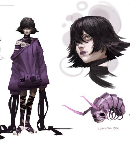
In addition to the main costume concept illustration, I did a callout sheet of both characters’ headpieces for a close-up version of that particular area. It’s important to communicate to your art director, production artist, or whoever will have to use this piece of concept art not only how it looks but also how it works.
In Celtic mythology, there exists a creature wearing deer antlers. Inspired by that idea I designed more around the character’s headpiece. I added sharpened twigs to his old trucker cap and integrated some of his leftover hair, making it hold together with barbwire. That combination seemed to work well and resembled the antler aesthetic I saw in the Celtic myth creature.
Both enemy characters ended up having their faces mostly covered by shreds of fabric and parts of military scrim nets. Not only does this help to make the costume more mysterious and creepy. It would also save cost since the facial expressions don’t have to be animated for the production of the game.

Color Variations
I blocked in some local color to try out different color variations. My reference board was of great help when it came to approaching which colors I should use. I knew that most of the tactical gear, as well as military boots, would probably look most convincing rather than muted colors. Also, the audience is used to seeing that kind of equipment worn by soldiers or hunters. It’s meant to have a camouflage effect.
I played with more extreme colors to see how far I could push the design. The guy with the orange top was inspired by a signal vest worn by hunters. The red accents on the female character should resemble blood and add to the terrifying appearance. When I was trying out the pink top my intention was to play up the stereotypes which exist around the hillbilly subject.
I ended up with a red checkered shirt for the male costume. Denim hot pants and a white top for the female costume seemed to be the most appropriate choice since those color combinations communicate the initial Idea I had in mind for those costumes.

Final Image
For this week’s assignment, we had to decide on a background for the final character costume illustration. At the beginning of this course, I came up with a little backstory that would take place in a post-apocalyptic environment. Prior to this class, I used to work on some environment concept pieces. I picked an abandoned barn interior as well as the shot which shows the main gate of a survival camp as backdrops. I spent the rest of the time rendering and integrating the characters into their backgrounds.


Final Thoughts
I really enjoyed this class. It was one of the best courses I’ve ever taken. The ability to push me beyond my first ideas and not to settle on a sketch too early was my biggest takeaway. Phil did a great job pushing us students just enough so we would go the extra mile which led to a more unique design. During the live Q and A, the students and the Instructor had the chance to look at each other’s work and to bounce a few ideas around which eventually improved the quality of each other’s work.
My biggest advice to future students would be not to settle on their first sketches. It is worth exploring and going all out. You will be surprised how far you can push things.
You can see more from Martin here:
https://www.artstation.com/simplejack1983
https://www.instagram.com/mhmillustrations/
https://imgur.com/a/L4VSlAN


