Capturing a Character
Illustrator Daria Burkut tells us about her process for bringing a book character to life over 8 weeks in Character Design for Production with Nate Wragg
Introduction
Hello! My name is Daria. I am an illustrator and animator currently living in Cyprus. I started to pursue art quite early when I was in elementary school. However, my career as an illustrator started only around four years ago. I graduated from Saint Petersburg Polytechnical University (Russia) with a Bachelor’s degree. My final assignment was to create a digital children’s book. Later, I studied in the Skills Up School in Saint Petersburg, where I had a lot of practice in academic drawing and digital painting. Now, I am studying Animation at the University for Creative Arts.
During my career path, I have been working on various projects, including illustrations for children’s books, articles, and even short animated films. However, I felt stuck in character design. I had heard a lot of positive reviews about CG Master Academy, and Nate Wragg’s courses in particular. I decided that it would be a great chance to get a deeper insight into the professional character design process with personal feedback.
Designing a Character With Story
While watching the first lecture of the course, I was mulling over which character I wanted to explore during the eight weeks. I wanted this character to align with my student animation project for the next semester at the University. I hit upon the idea of taking a story from classic Russian literature. I could choose from authors such as Pushkin, Dostoevsky, and Bulgakov. I eventually opted for one of my favorite novels, “Crime and Punishment,” by acclaimed Russian author Fyodor Dostoevsky.

The main character in this novel is a young man, Rodion Raskolnikov. Outwardly, he is tall and handsome. His personality traits can be described as grim and arrogant. At the same time, however, he can be very generous and noble toward those he loves. Rodion was a law student, but he now lives in extreme poverty. As the culmination of the story, the young man kills an old lady: an unscrupulous pawnbroker.
During the lectures, Nate has always reminded the students to think “story first.” While I was searching for the character’s shapes and proportions, I found it crucial to stay loose and explore with thumbnails. It is a great approach that prevented me from adding details too early.

Character Pose & Expression Sheets
Weeks 2 and 3 were devoted to the development of the character’s poses and expressions. Nate’s lectures focused on essential things like lines of action, finding references for poses, and pushing characters as far as we could. I was trying to find poses that would be specific for my character. Some poses seemed to be too static and generic, so I rejected them.

I wanted every pose and expression to tell more about the character to the viewer. Even though Rodion is acting as a bad-tempered and arrogant person most of the time, his nice personality traits are also essential. Thinking about the story allowed me to continue pushing the poses, and the expressions, further to make it clear and interesting.

Model Sheets
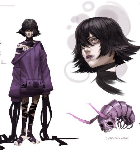
While I was working on a turnaround of the character, the biggest challenge was to find the best way to show the character’s coat. This coat is one of the most important features of my character, so I wanted to include it in the turnaround. Finally, I settled on the idea to make the coat and hat red to contrast with the black color of the character.

In general, creating model sheets was easier than I had thought. Nate explained how to use guides in order to make everything aligned and tidy. The biggest revelation of this stage was how the exploration of the character in 3D space helps to see which design choices work and which do not. Sometimes, while designing some features from one view, it is hard to understand how it will work spatially. Making a turnaround is a great way to deal with this concern.
Hero Pose
Working on a hero pose of the character, I started with a posture that turned out to be not readable enough. In this pose, the character had three props that began to compete with each other. Nate pointed it out and suggested refining it by changing the pose and losing unnecessary props. Finally, I ended up with the hero pose, which showcases the personality of my character much better. Because I took a story from Dostoevsky’s novel, it was crucial to make Rodion recognizable. I decided that a moment right after the crime would be the best option for my character’s hero pose.

The main prop that I used was an axe. Rodion murdered the old lady with the axe, so this prop is essential for the character. In the hero pose, Rodion is trying to hide the bloodied axe inside his oversized coat. This coat, which looks like a rag, is also a significant prop for storytelling.
When I finished the line art for the hero pose, I began to explore different options for value and color. I wanted to make the axe eye-catching, even though it is not shown in the silhouette. The best way to do it was by adding contrast in values. I made a number of value and color thumbnails and settled on one with the light axe on the dark coat.

Putting It Together

I was very inspired by the lecture in Week 7. Nate explained how to showcase that the character is functional for a movie moment. It was not hard for me to choose a moment from the story. The main scene in the novel is when Rodion killed an old lady. I started by sketching a new character – the old lady – and the interior of her room. I wished to compose characters and objects so that they would lead the eye through the scene. In creating the additional character, I emphasized the distinctive shapes but kept the main style. During this stage, I referred back to my research and gathered new references for the old lady and the environment. I added a big window behind Rodion to maintain his silhouette. It also allowed me to light the scene in a dramatic way.
Final Thoughts
As I noticed during the course, Nate’s idea to keep a clear design also extends to how he organizes the lectures and how he explains his thoughts to students. He always paid attention to the most significant aspects of work. As a professional who has been working in the industry for many years, he could easily say which parts of a design are strong and where it is better to continue refining it. One of the most enlightening insights from the course was that thinking of a story first really helps to make a design specific instead of fixing on some generic options. For example, when I was working on Rodion’s poses, I tried to think about the specific actions my character would do. Another idea that became underlying for the course was to stay loose and trust the process. It helps not to put too much effort into the very first idea. Moreover, it was great to follow the professional pipeline and learn how people work in the real industry of featured films. I am grateful to Nate for his mentorship during the course. I have already started to apply this new knowledge to my work.
You can see more from Daria on her site below:
Behance – https://www.behance.net/orestovna
Tumblr – https://dariaburkut.tumblr.com
Instagram – https://www.instagram.com/orestovna


