The Step by Step of Sindriira
Concept Artist Brendan Milos gives us the breakdown on the course Character Design for Film and Games and uses all the tools he can to render his D&D inspired character.
Biography
Hello! My name is Brendan Milos and I’ve been working as a game artist in the San Francisco bay area for the past 10 years. I have professional experience doing almost anything in the art and design pipeline, but my passion is in character design. I decided to take Character Design for Films and Games taught by Marco Nelor because this is the area that I am most interested in honing my skills. Marco is incredibly talented and has been an excellent mentor in how to design compelling characters.
This article outlines my character design process for an original character, Sindriira Sh’laar, the dark elf death cleric. Hope you enjoy!
Research & Development

It’s important to start with a character write up. This narrative describes who the character is and what they look like. Marco created six-character write-ups in science fiction and fantasy as starting points. I started with the Cleric/Warlock template and refined it by researching this character class in Dungeons and Dragons (D&D). Pen and paper RPGs have rich world-building and easy character creation steps that assist in refining the design.
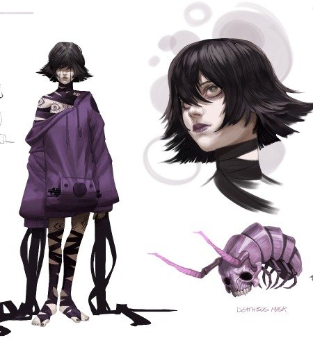
Sindriira Sh’laar is a dark elf born into nobility, raised on the value of tradition, and trained in the arcane arts. The dark elves revere vampires and so Sindriira received what is known as the Kiss of Lilith as part of the final ritual in her training. With the merest gaze, she can freeze the viewer into a state of awe, bending them to her will. Her goal in life is to become the house matriarch as a way to continue her society’s values and influence many future generations.
For gathering references, I usually go to Pinterest first. I like to gather references for every aspect of the character including outfits and accessories, personality, and some figure model references. My personal taste as an artist is inspired by Castlevania, The Matrix, Vampire: The Masquerade, Magic: The Gathering, H.R. Giger, and The Elder Scrolls: Skyrim, so that influences how I mold the reference into my own designs.

All of my digital painting is done in Photoshop. For the thumbnail sketching, I explore as widely as possible. Each subsequent step in the design process is about narrowing the list of potential outcomes so the first step should be about idea generation and not editing. Set a few broad design stakes in the ground (i.e. vampire, female, royalty, mage) and then sketch as broadly as possible with those constraints. Thumbnails are about ideas over anatomy. Don’t sweat the details, just focus on the initial read-through silhouette and shapes communicated through solid blocks of value.
Sketches for a Client

For this particular project, the better designs were created in the back half of the sketching process. This usually happens for me because I get all the obvious ideas out of my head first then explore designs that I wouldn’t normally. The contrast between large and small silhouettes create balance, while accessories like crowns and capes convey regal status. I like to send out options to other artist friends as a way to get feedback from several people. When I hear a pattern of feedback, that helps me to objectively view the pros and cons of each design.
The work done for week 1 helped the selection and refinement process. When it comes to making art, any process I can follow that breaks down into granular parts helps me achieve consistent results, even if I’m having an off day. Week 1 was about establishing design constraints and sketching as wide as possible within them, and week 2 was about analyzing and selecting what’s working and what’s not. Just like writing and editing are broken into different phases, breaking those steps into separate weeks is important.
Narrowing Down the Selection

Marco pointed out a few helpful aspects that helped me choose my final design. First, the proportions of my characters weren’t heroic enough. Most figures in real life are about 7 heads tall, but a heroic character is about 9 heads tall. I extended the legs and arms, especially the thighs, in order to make my character’s pose read more realistically. Practicality needs to be considered when designing costumes. Some of the designs in week 2, especially B, have more of a costumed look rather than like a person wearing their natural, functional clothing.
The last big piece of advice that Marco conveyed was to fully develop the designs. Don’t leave big gaps in the uniform that could use a bit more design. For example, design C from week 2 had a lot of good aspects, but the torso was completely blank. Refining the design is about exploring a higher level of intentional detail after the main blocks of form have been figured out. This idea is a balancing act as there will be a point where a costume needs some larger areas of less detail.
Head Explorations

Sindriira is arrogant, capable, confrontational, and shrewd. Conveying this personality through the proportions in her face was the main challenge of this week. I explored the narrow, angular features found in a lot of Elven characters as well as large or piercing eye shapes. Features like the drawn up eyebrows, pursed lips, and swept-back hairstyle were also important to convey nobility and conscension. Doing a turnaround of the final portrait helps me figure out the form in 3D space.
Character Through Gesture

I wanted this character to look powerful and in control through her body language. The camera is at a low angle looking up at Sindriira to make her look strong. She uses her magic to levitate while bringing her whip chain around to attack in a twisting fashion. Making the character pose dynamic was a process in this class. I started with small thumbnails focusing on the gesture or energy of the pose. The figure should have contrasting angles and twists to make the pose interesting. Over the next few weeks, I redrew so many aspects of the character to bring the energy of the thumbnail into the final piece. Posing is definitely something that I could improve on and is essential to communicating what a character is about.
Pushing the Pose


At this phase in class the design was headed in the right direction, but the pose was still feeling stiff. The initial method I used to pose the character involved cutting out and free transforming pieces of the standing pose like a puppet. While this method can save time in some scenarios, this meant the figure didn’t twist in perspective in the way my gesture did. I had to redraw entire sections of the character from scratch to make the pose more dynamic.
Make sure your perspective, angles, proportion, and lighting are drawn well before rendering too much. Rendering is like icing on the cake, so don’t render too soon otherwise you will end up erasing, re-drawing, and re-rendering if you don’t get these foundational aspects drawn accurately. That can waste a lot of time.


The shoulder armor was really tough for me to draw in perspective accurately. After a few unsuccessful attempts, I used Blender to 3D model the main forms in perspective. Blender is a free 3D modeling and animation program with plenty of online tutorials on YouTube. I spent an afternoon learning the basic hotkeys and making this model, taking a screenshot, and drawing on top of it back in Photoshop. Modeling software can be helpful for drawing hard surface materials in perspective.
Polishing and Rendering Techniques
#1 TAKE YOUR OWN REFERENCE PHOTOS.

Rendering is about lots of time. The more time spent rendering, the better the render. Accurate anatomical details are an important part of reaching a final, polished render. I always have better luck with rendering hands and other specific anatomical details of a pose when I take my own reference photos.
#2 USE GRADIENT MAPS TO COLOR A GRAYSCALE IMAGE.

For this project, we built up the forms in grayscale first before applying color. The benefit of painting this way is that it is easier to see lighting and form without the distraction of color palette. In order to give me a jump start on transitioning to the color version, I used Gradient Maps in Photoshop. Gradient Maps are an adjustment layer where one can specify a color to replace a value. The example above shows how a first pass on the skin looks with a gradient map. This is only a first step and there was a lot of painting on top of this to get the final look of the color painting.
#3 PHOTOBASH TO ADD DETAIL OR REALISM.

One last technique I used was photobashing. This is a technique where an artist places stock photography or photo textures in the image as a means to save time or to get a sense of realism. The trick is getting the photo to blend in with the hand-painted parts. This involves making sure that the overall color and lighting matches as well as making sure the level of detail is consistent between the photo and hand-painted areas. One trick is to use a Surface Blur to reduce the noise or grain in a photo to help it blend.
#4 LISTEN TO FEEDBACK AND BE PERSISTENT.

Out of all the challenges I had on this project, rendering the face was the most difficult. The face and head are especially important to spend time on in order to sell the design. The face and head are the viewer’s gateway to appreciating your character. There were a few things that made the portrait difficult for me. First, the angle looking up at the face is one of the toughest to draw. Second, the character is a humanoid fantasy race, so finding that line between fantasy and anatomical realism was a difficult balancing act. Third, female faces often come with the expectation from viewers that they need to be conventionally attractive, or else the design feels distracting.
I shared the work in progress with a lot of different people online and had several weeks of negative feedback regarding the face ranging from “cartoony” to “lumpy” to “ugly”. Part of being an artist means listening to feedback, even when it’s not easy, and constructively applying it.
Glamour Shot


Spending multiple weeks on one character design meant I had the opportunity to keep revising the design. Each week, Marco gave me the direction I needed to continue improving on the prior week’s efforts. The additional feedback from other artists was also invaluable. The end result is much more realized than the initial week’s design, including the use of a background to communicate the kind of world this character inhabits.
I always imagined this scene as some sort of vampire ritual. The heroine is raising her magical chalice in a toasting gesture while levitating above human livestock, draining these tortured souls of their life force. The chalice in her hand is her magical artifact. Clerics need to hold or display their magical artifacts as a way to use their powers in D&D lore. The chalice was chosen as a symbol of vampires drinking blood like royalty would drink wine. The whip chain, her weapon of choice, lacerates her enemies. The more blood she consumes as a vampire, the stronger she gets. Her crown, a large cloth hairpin-like two batwings, keeps her hair back out of her face. As her subjugates become weak, their remains become part of the boney spires that dot this landscape.
Moving Forward

There’s an old saying that we never finish our projects, we only run out of time. I believe this statement to be true when it comes to being satisfied with any given art piece. That’s why I continued to work and improve the illustration after class ended. That being said, I also have to recognize when it’s good enough, let it go, and then move on to the next one. This is the best way I know to stay productive as an artist. Not perfect, but it’s finished :).
The main skills I improved on in this course are patience and persistence. Patience is number one. Be diligent in separating the phases of design, from thumbnail to render, and don’t rush the process. The more steps you split the process into, the more refined the result. Persistence is about not giving up and revising until I’m happy with the results. This class taught me that finishing projects is about being disciplined enough to work on a painting until all of it meets a certain threshold of quality.
You can see more from Brendan here:
Portfolio: www.brendanmilosart.com
ArtStation: https://www.artstation.com/brendanmilos
LinkedIn: https://www.linkedin.com/in/brendanmilos/


