5 Ways to Undo Bad Illustration Habits
Artist Cassandra Mazur wanted to expand her visual design language by adding variety to not only her portfolio pieces, but her habits as an illustrator. Read on to she how Cassandra broke away from her old habits and obvious design choices through 5 out-of-the-box projects, including:
 My name is Cassandra Mazur. I am an artist living in Chicago, Illinois. I work at an Advertising/Marketing agency during the day and pursue my other creative endeavors in my free time under the name Cult Fiction Press. I took Art Direction for Character Designers taught by Nate Wragg to retool my portfolio for my specific goals of working in animation as a character designer.
1. Lennon in Lemon

For this first assignment, I chose to illustrate a yogi/guru-type character. I wanted to use the color yellow and this type of personality seemed like a good fit for it. I also wanted my animal to be some sort of ape and the idea of the two characters doing yoga together became very appealing to draw. While collecting references, the character became clearer. He was inspired largely by John Lennon so I took a lot of the shapes for my character from him. The round glasses were repeated in his head shape, and the hair and beard were taken from my reference. I love to draw hair so I put a lot of emphasis on it as I knew I could do the same for my ape character.

The hard part about using the limited color palette was making decisions on where there would be lines and where negative space would be used. I wanted to limit the number of details on his body because I had already added many lines in his hair and beard. To balance this out, I decided to use his pants to help define the shape of his legs.

If you're also itching to play with color, check out CGMA course The Art Of Color And Light
For the critique, Nate suggested exaggerating his posture and elongating his arms to elevate the character. Looking back at my drawings now, I could have pushed this more in the drawing for the second week. I could have made his arms longer and pushed the proportions farther than I did.
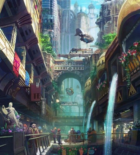
For the background part of the assignment, I decided on a meditation garden. It was inspired by one at my local botanical garden. Nate suggested that I simplify this more as the characters were getting lost in a lot of the details. I also really liked the composition of this layout and later decided to paint the garden as another piece for my portfolio.

If Cassandra's meditation garden piques your interest, explore CGMA course Composition for Concept Art and Illustration
2. De-Abstracting the Abstract
At first, I was really struggling to come up with an object to use to incorporate in this assignment. In my house, I came across a straw and because of its unique shape, I thought it could be an interesting prop. I thought it would be clever to tie the function of the straw back into human anatomy, so I made it the mouth of my character and the focal point.

From there I worked backwards for inspiration and started looking up news articles that I could use to tie the concept together. I found an article about sports drinks and I built my character around that. The abstraction of the straw really helped me push my shapes and helped take me out of my comfort zone. I was better able to see past more obvious choices I had made in the past out of habit. I really like how this one turned out.
3. Yetis and Ice Cream

This turned out to be my favorite assignment. I played around with a few different monster concepts before I got to a place that I was happy moving forward with my yeti creature. For the critique, Nate suggested I smooth out his hair and simplify some of my shapes for a more polished look.

I wanted to do a take on a yeti as a mascot for an ice cream company, my take on Blue Bunny. Using my graphic design skills, I made a logo and a mockup for my ice cream box. Nate helped me push the design of the character on the box and have him really sell that he wanted this ice cream with more expressive body language. I think it turned out great! One of my favorites!

Looking to design your own unique characters? CGMA course Fundamentals of Character Design is for you
4. The Shoot Out
This was one of my favorite styles that I worked in. Nate had provided a short list of movies and tv shows we could choose from for this. I wanted to do a movie I had never seen before, mostly so I could watch a new movie. I chose A Fistful of Dollars.

Clint Eastwood's character in the film has the best costume and props so I chose him to illustrate. I found screencaps of the movie for reference. The most pivotal scene was the shoot-out. I loved working in this style since it helped further push me into more abstract shapes and away from design choices I would have made previously. Nate suggested that to help with his silhouette that I change the placement of his cigar, which I took directly from what I saw in the movie. The new placement reads much better as a cigar. I also think this style works really well with the film. The history of this illustration style also comes from around the same era as the movie. The gritty sandy texture also helps tie everything together nicely.
5. Ripe With Jealousy
During this last assignment, I was watching a lot of Project Runway so the idea of making part of an inanimate object also part of their clothes just naturally came to me. I liked how the peel of a banana could become part of its wardrobe. Because of the color of what I imagined would be her hair, this Marylin Monroe-type movie starlet character came to mind. Nate suggested that I push her pose to help sell this character and her actions. A more simplified silhouette did the trick. I used this for the next week’s assignment. For the rival, I based this on an older jealous starlet.

My story revolved around the idea that this fresh banana was new in Hollywood and the more established overly ripen banana was jealous as her fans now favor the new girl in town. The innate characteristics of the banana and how the color of the peel changes color over time made for a great costume for the character foil. The ice cream fans were the cherry on top.
Final Thoughts
- Overall, this was a very fun class. It has several levels of challenges in each assignment that helped me make some great work. First, the ability to match the style of the art direction. This is something that is very helpful in production work. The second is understanding the character you are creating. The more you understand who this character is, the better the clearer the story becomes through your choices. The third is acting, which comes through posing, silhouette, and use of props.
- My biggest challenge is and was the acting aspect. Being able to balance the clarity of the silhouette while exaggerating the pose is something, I know I need to work on more from taking this class.
- The first assignment was the most difficult for me because the limited palette forced me to concentrate on shape and line more so than I would have without the limitation. The later assignments helped me get out of some of the habits I naturally tended toward when I draw.
- Looking back at my first assignment I can see opportunities to push these shapes further. Some of the shape choices I normally make out of habit were easier to move past. I was better able to push through some of my choices and was better able to exaggerate within the limitations of certain styles.
- Classes offered by CGMA have helped me tremendously by keeping me accountable while also helping ensure I have portfolio-worthy, relevant art pieces.
- If you’re looking to push your natural style and unlearn some bad drawing habits, this class will help you get there. You’ll also get some great portfolio pieces if you put in the effort.
LEARN MORE
CGMA provides comprehensive instruction for Art, Games, and VFX industries in a variety of courses for a range of students, from 2D and 3D artists looking to supplement their college studies to industry professionals looking to stay up to date on emerging trends and techniques in the field.
RELATED LINKS
If Cassandra's meditation garden piques your interest, explore CGMA course Composition for Concept Art and Illustration
If you're also itching to play with color, check out CGMA course The Art Of Color And Light
Looking to design your own unique characters? CGMA course Fundamentals of Character Design is for you


