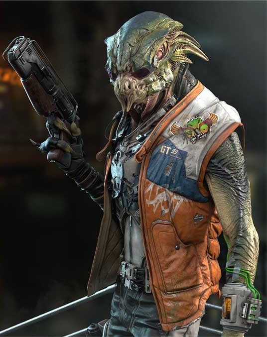
4 Ways Design Can Transform Your Comic's Narrative: Monsters Among Us
Freelance concept artist Marina Ortega breaks down "UNBORN," a psych-thriller. From page composition to location to character design, read on to follow Marina's creative and technical process.
Background
My name is Marina Ortega Lorente and I’m a Spanish freelance concept artist based in Manchester, UK. I studied Fine Arts at Complutense University of Madrid, and later online at CGMA. After a while, I became freelance full-time, which I've continued for the past 4 years, working on “The Forest” and “Beyond a Steel Sky” with Revolution Games. I specialize in environments, where I enjoy playing with mood and lighting. My favourite part is trying to capture the feeling of a situation and have the viewer experience it through my work.
So, this doesn’t necessarily sound like comics, but I felt I needed to convey the essence of the story behind an image more efficiently. Plus, I wanted to work on something more narrative-driven than the usual descriptive concept art breakdown sheets. So in the hope to get a new perspective, I decided to jump into learning one of the more exigent and complex ways of visual communication. Comics.
The Script - Visualizing "UNBORN"


The initial script looks way easier than it was. I had never written a story in a script format with such short descriptions and dialogue. I wanted to develop my project and I had this Unborn universe of my own creation in mind from before the course. It’s about the “monsters” that are more than just that, living among us, rarely visible but influencing us all. The only person who can see them is our protagonist, Dana.
This week was about organizing the chaos of possible scenes in your mind in a reasonable number of panels without format. It was also for getting those first ideas out as very rough sketches. Nothing was set in stone, but facing blank pages would have been daunting without this assignment and Miki explaining how to face this first stage. It’s a key first-step that is truly for yourself, as you will be redrawing these a lot once you start shaping the panels and fleshing out the page.
Page Composition - Guiding the Reader
The composition of the page plays a big role in how the story is understood by the viewer. It is vital to conveying narrative, as image composition is key to the storytelling of any illustration. But instead managing just focal points and rules of composition, you are creating on a bigger scale. You have to think of the simplest, most striking way to tell the story, and how to use the flow of the page to reveal plot. Controlling how the eyes of the viewer move around the page-- when and how they receive each piece of information -- it's hard to make it both comprehensive and exciting.
Read "6 Steps to Master Illustration Composition: From Apartment Scenes to Ghoulish Posters" to learn more about optimizing composition.
You have to imagine how someone that doesn’t know the story yet is feeling at each point. This is one of the most difficult things, and the part you will probably need more feedback on if you are not experienced in comics. There are some rules to follow, but as it happens in art, many things are subjective and particular to your story. This week, I altered the panels a lot, and they became simpler and more organized to tell my story.
Drawing and Reference Research - Considering New Angles

This assignment was more in my comfort zone. As a concept artist, reference is your first and best friend. I decided to design some key locations in this comic. Although I had to translate them later into the graphic, which meant incorporating a high contrast style and adapting lighting, it really helped to pause and consider the design of the key or hero locations, objects and characters before adding them into the story.


It is important to take some time here. The design needs to serve the story, which requires some reflection before going straight to draw the panels. You also need to think about drawing these locations from different angles to maintain cohesive design.
Miki also showed us how he uses not only reference for design, but basic 3D for some key locations. He demonstrated how rotating the camera can provide some perspective and size information quickly and efficiently. Which is really useful when you need to draw something in different angles.
Character Design and Flat Coloring - Setting Tone

Characters
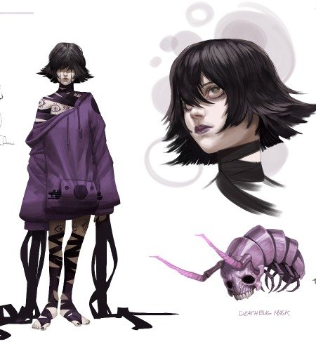
For character, I considered colour or actually going for a high graphic contrast finish. My comic is a mixture of horror and a psychological dark story, which has more to do with the darkness of our mind than with actual monsters. So I looked for a muted palette that would allow me to emphasize and play more with the color and intensity of lights, rather than the local colors of materials. Seeing Miki’s process for coloring step-by-step is still helps me nowadays, even in concept art.
Explore CGMA 2D Character Design courses to develop the best characters for any story.
Panels
On the other hand, I began to play with graphic contrast style and different textures more than color because I feel that kind of noir feeling fits with a rainy night in a dark city. So I decided to not only play with colors this week, but look further regarding the style I wanted.
Read Quick Tips for Better Texturing to learn about texture for 3D purposes.

FINAL THOUGHTS
- In this class, every step of the process has to come together for the final product. From script outlines to locations and character, all of my pieces evolved together. With that in mind, I think I am most proud of the final week.
- I felt I improved at reducing the story I want to tell to the most important elements and letting go of the things that are not contributing or supporting the story.
- I spent more time considering how to be in service of the narrative and the importance of page design and flow. Miki helped me a lot with this and to understand how comics work. It is not just creating beautiful panels, it is about guiding the eyes of the viewer within the pages at the pace and direction you want. You need to manage and control tons of information at different levels.
- I cannot recommend this class with Miki enough. He is an amazing teacher and professional. He takes into account your background, level, and your strengths and weaknesses, to guide you while he provides tons of useful information. Not only about the comic itself, but about the comic world and how to be an artist in it.
- I took this class as an introduction of comics for one of my personal projects. Now I want to develop other pieces of art, like keyframes and not only comic panels, so more than being a finished comic, the class has become the beginning of something else for me.
RELATED LINKS
Read "6 Steps to Master Illustration Composition" to learn more about optimizing composition.
Explore CGMA 2D Character Design courses to develop the best characters for any story.
Read Quick Tips for Better Texturing to learn about texture for 3D purposes.
LEARN MORE
CGMA provides comprehensive instruction for art, games, and visual effects industries in a variety of courses for a range of students, from 2D and 3D artists looking to supplement their college studies to industry professionals looking to stay up to date on emerging trends and techniques in the field.


